Colour theory in the psychological field is used to determine the impact of a certain form on a person. It is well known for designers that shape or content can be misunderstood when their colours are wrongly chosen.
It’s common knowledge that warm colours go with positive, stimulating and alarming emotions or impressions, like feeling energised, young, cheerful and playful, while cold ones epitomise professional, safe, calming and reliable adjectives for the design.
What I want to approach is another bunch of colours, which elicit different emotions depending on the context in which they are used, and in themselves they are elastic and associated with – in fact – nothing when they are used in design. The colour itself of course has its own meaning, like black is strong or murky, but can be used as depressing or powerful, chaotic or sophisticated. White, in its clearness and innocence, can create a feeling of emptiness, but it probably has the most important role of all colours – creating negative space. Something we never see unless it’s gone. White space can play a huge role in web design, indicating what is more important or creating the sense of order or chaos.
Monochromatic how to
Monochromatic design is perceived as minimalistic, and sometimes modern, as it’s actual and popular in today’s flat, material and vector-illustrative design (although it has its sparks all over visual art history). On one hand, using one colour can be seen as an easy way out for a designer who can’t juxtapose colours in interesting and powerful palettes, but on the other – this style in the hands of an expert can create a really stunning effect, exposing the form and the content. Using only one colour can be a blue sky or a total failure for the end product. There are a number of ways you can plan the monochromatic or bichromatic palette:
- Choosing one colour and several lighter and darker shades, adding white and black or a complimentary colour when mixing;
- Choosing one colour as an accent for a greyscale composition;
- Making the design only in greyscale (achromatic).
Emotional effects of the methods mentioned in points 1 and 2 are absolutely dependent on the chosen colour, and in the second instance also the relation to the greyscale, that’s why I’m going to focus on point 3 – using the greyscale.
Why black and white?
Using no “real” colours creates a possibility for the designer to work with shapes – their sizes, contrast, texture and position, which are the only “something-is-happening” for the viewer. The range of available means lets the designer sculpt, just as in clay, to make users discover the real point of the matter, focus on the content without any redundant distractions. That’s exactly why designers start with black and white wireframes, painters sketch their compositions with a raw pencil and photographers make black and white portraits to show a person’s emotions. As material design is an illustrative metaphor of real objects, the greyscale can be a symbol of the thought. It helps to represent, therefore see, a clear story, it’s honest and steady and needs the creator to know the art of balancing on emotional lines. It’s the reason why it’s so difficult to create something really tasteful and expressive – it’s a combination of design skills, emotional intelligence and some sociological wisdom.
Monochrome in greyscale is a means to express anything. It draws attention to the detail, to totality, as you tell it to. It’s an all-purpose tool to achieve any goal, but clearly it can also make the website or different form simply uninteresting, depressing, unimaginative or give it this obsolete feel of the Windows 95 era, if you can’t be the master and keep it in check.
Building a relationship
Creating design forms with only black and white colours consists of at least 6 things:
- Shapes – not only geometric elements but overall composition, the borders that every physical element closes in.
- Contrast – high contrast is gaudy just like bright colours, while low contrast creates a calm and professional feel. This can be a real ambush for the designer in the matter of usability.
- Position of elements, which can have an overwhelming or adverse impact.
- Typography – letters, font sizes and icons draw more attention now.
- Luminescence is the real key for atmosphere together with contrast.
- Collision of all these aspects – it’s important to keep the leitmotiv based on the project brief in every decision about the design.
If you are in need of design being described as simple, even condescending, artsy, minimalist, content-focused, getting straight to the point, it is wise to take monochromatic design into consideration.
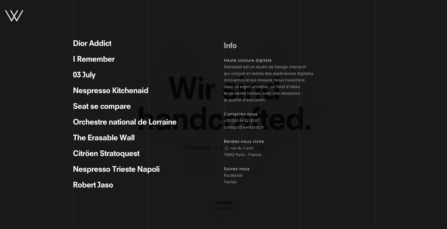
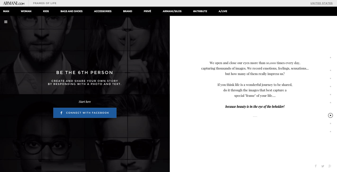
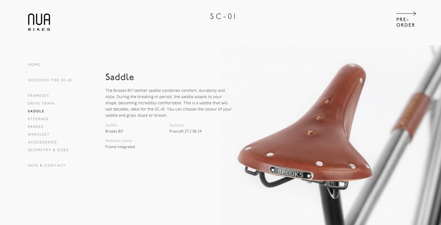
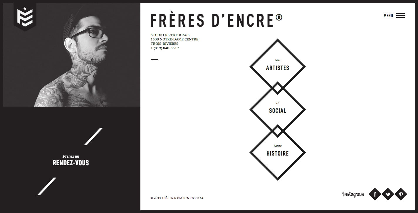
Examples