HOW TYPOGRAPHY AFFECTS THE USER’S PERCEPTION OF THE WEBPAGE
Klaudia Migacz
Ever since I noticed that the application we prepared has expanded significantly, I have decided to find a completely new method for automation of the process of its launching.
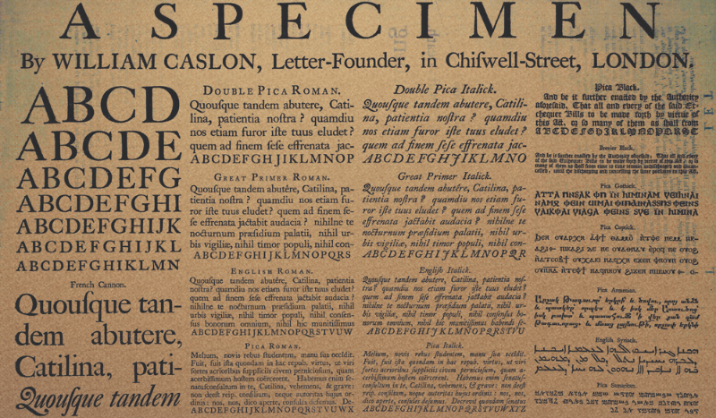
What is typography and why is it important? The huge development of the printing art in the last decades is the result of the general development of civilization and still growing cultural needs of mankind. Typography is one of the areas which function is to hide in the shadows. Reading articles, scanning the pages and looking for information shouldn’t make user pay attention to the fonts, line spacing and text alignment nor enlarging or reducing the font size. Unfortunately, the need of invisibility also causes difficulty in understanding the significance of it. Typography is art of using the best matched forms of lettering to the media.To choose the right font face it is important to ask a lot of marketing questions as: what’s the length of the text, what’s its purpose, what’s the most important, what the text should help to achieve? And questions about technical issues about readability and aesthetics, the feel of the text (does it have to feel serious and professional or rather unofficial or decorative) and if the text will be read or just scanned by users. If we know the specification of requirements and the audience, it’s easier to choose the right typography for the project and aim all the goals set for the text.
HOW THE USER WANTS TO SEE THE TEXT ON THE WEB – READABILITY
The brain likes harmony, and the eye moves easily through the text if there’s adequate space for it – subsequent lines appear in predictable places. If line height, font size, paddings and margins are matched in a consolidated manner, there should be rhythm in the text block.
It is important that all the subsequent lines repeat the same rhythm, just like the other elements on the page. Picking the right height depends on the font size and face. The higher the size, the height of the line should be higher. Traditionally it is determined that the optimum ratio of the line height to the font size is 1.3 to 2 (or even more for special cases). The selection affects the size of the padding and margins that should be used. To get the elements arranged well and the distances to be accurate, it is very helpful to place the image of horizontal lines and try to put elements so they begin and end with both lines, and the text is among the latter. Defining the height of the line is a less sophisticated method than the baseline alignment but it does the job well, and at the same time is easy to code and maintain.
The least noticeable element of typography is whitespace, but at the same time its possibilities are huge. Whitespace is not only light between the words and line spacing, but also all the spacing between elements. Leaving margins blank is not a waste of space, but assisting the hierarchy. Proper selection of white spaces may also specify the nature of the design.
The font size is also important. Too small fonts, although they are often associated with professional design, are generally difficult to read or at least reduce the speed and ease of reading. Not without reason, almost all browsers as a default font size accept 16px. Too large font can be difficult to read too. Among things that determine readability there is also contrast – it’s expected to be optimal, and people are more accustomed to reading on a light background. Pages with lots of text should avoid dark graphic designs. In recent times it is common for web designers to reduce the contrast between white and black in order not to strain the reader’s eyes.
In all that, the most important thing is moderation and transparency. First of all, you can’t really see good typography – it just melts into the background and lets you read your thing. From a technical side, two fonts make a good team, more in a simple design is already a crowd. In most cases the selection of two fonts is sufficient to achieve all purposes. There should be one style for headers and the other for block text. Links should be easily identifiable. Poorly chosen fonts via @font-face can be cumbersome to the eye when using antialiasing. The same thing happens if fonts are carelessly used in Flash. Blurred letters tire the eyes and slow reading. Also, bold, italic, caps and other highlighters should be used alone (bold italic already too much). The decision about highlighting the text parts and what is the rule of making them should be made at the beginning.
Reading long texts requires concentration. Very often the user’s attention is distracted by ads filling column on one or both sides of the article. If we want the user to read them to the end, the number of items that can be distracting should be limited.
THE ART OF TYPOGRAPHY AS A MARKETING TOOL – TYPOGRAPHY IN LOGOTYPES AND ITS ASSOCIATION WITH THE WEBSITE OR APP PROJECT
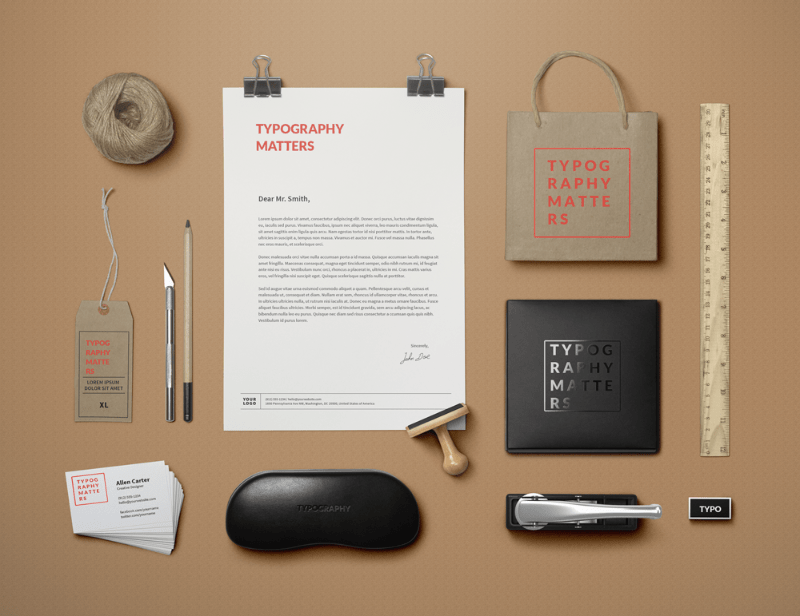
New patterns of the typography and lettering were developed mainly by expansion of commercial advertising. Visual identification containing posters, brochures, packaging or advertisements and the most important one – the name and the logo in addition to graphic contain text information. This text in order to fulfill its purpose should be communicative, clear and attractive, and also harmonized with the illustration and the nature of the product being advertised. Adequately formed trademark can reflect the nature and style of the organization. At the same time the positive qualities and associations symbol will be the basis for building a favorable image of the company. Each organization is unique and its identity should grow out of its roots and experiences. The identity of the company should be simple and clear because it makes up a pattern to “measure” products, behaviors and actions of the company. That’s why it should be visible and covering all of the aspects to be an affirmation. Typography is a part of company identity, that’s why it should reflect its character and values. Corporate materials should correspond with the company and its goals, this means that all of the from business cards, letterhead, the manuals of products, newspaper advertising on the website and multimedia presentations should have uniform character. Properly selected typeface with their variations and layouts carefully designed elements will create an image of the company stable and effective in operation.
Therefore, typographic elements on the website or web/mobile application should be consistent with guidelines in a company’s brand book or if the use of the designated font family is provided only for printing – at least formed in a coherent relation.
There are trademarks consisting of the logotype (text) and signs containing a symbol (graphical element) and logotype. The signs made only with the symbol are quite rare. If the trademark is only a company sign, it’s necessary to provide maximum readability in all sizes of letters. The logo should not impede the reading of the name, which sometimes happens when for example the first letter of the name is distinguished. Adhering to the principles of correct typography lets the company appear as a professional, trustworthy and reliable partner, which can only lead to success for both sides!