Cyber Security Dilemmas: Data Leaks
The pre-Christmas rush is in full swing. In search of gifts for their loved ones, people are increasingly willing to “storm” online shops
 GO BACK
The web is used by millions of different people everyday, one of our main goals as developers is to make the web accessible for everyone. This article will introduce some common web accessibility issues and ways to solve them.
The most common accessibility issue I’ve seen over the years is the contrast and color accessibility issue, a bad contrast ratio will make it hard to see the content of your page and that will be very harmful to your users, including those with visual disabilities.
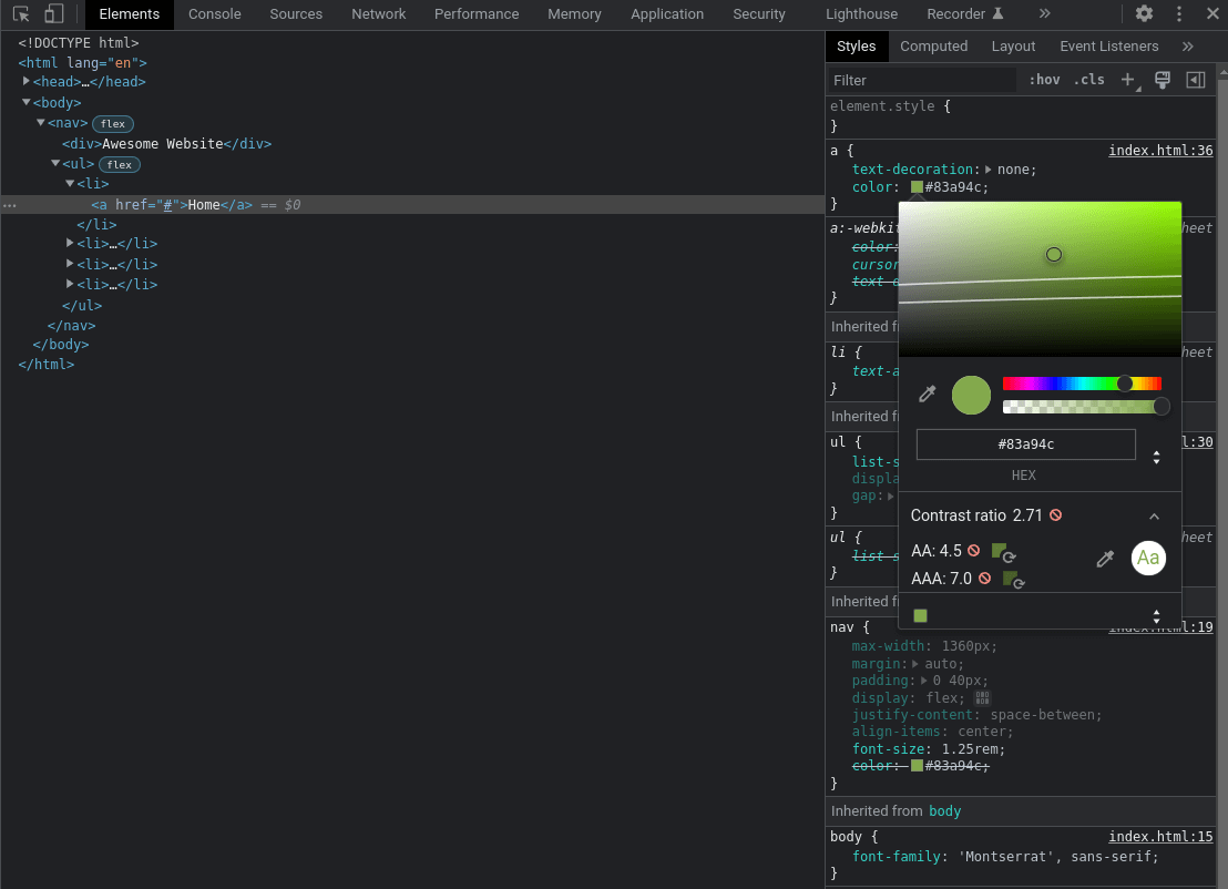
Contrast is a measure of the difference in perceived “luminance” or brightness between two colors, for example, it is the difference between the background color and foreground color of your page content. Let’s take a look at this navbar.

Let’s say your client really likes that greenish color and finds it awesome, but there is an issue here with contrast. We have a #FFFFFF background with a #83A94C text color resulting in a 2.71:1 contrast ratio, which is way below the minimum 4.5:1 needed. To detect this issue we have multiple solutions:

To get more details about contrast check this Contrast and Color Accessibility Article.
Links are a big part of the web these days, so making them accessible is very important. A link must make sense and inform the user of its context, so an uninformative link with text like read more, click here, check details isn’t very helpful so instead of adding “check details” for product details, for example, using the product name such as “The Mandalorian Helmet” is better and more informative. Words like click here or more about can be omitted because a link is clickable per default and something like “more about today’s news” can be shortened to “today’s news”. There is no special rule or limit about link length, the link needs to be readable and long enough to give a good description of its purpose.
Images as links are a widely used pattern, so this has to follow the same rules we’ve talked about above. The image alt attribute will play the role of link text and be announced by screen readers. There are multiple case scenarios when treating images as links, if the image is the only content of the link, then it must have an alt attribute, if the link has some text and image in it then we can omit the alt attribute, here are some examples:
<a href="/notifications">
  <img src="/img/notification.png" alt="Notifications">
</a>
Check out some links here to read about links accessibility:Link Text and Appearance, Functional Images.

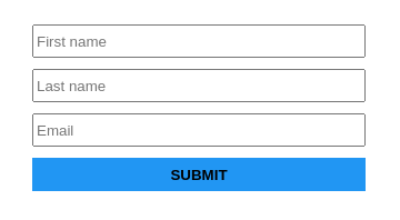
We’ve all seen these form inputs before with no label and just a placeholder to describe the purpose of the input. A first note is that as soon as the user fills in all the inputs and the placeholders aren’t in sight anymore we will have no visual context about the inputs purpose but let us focus on the accessibility here.
Associating a label to an input gives us two major advantages, a screen reader will read out the label when the user is focused on the form input and when a label is clicked or touched/taped the browser passes the focus to its associated input. An easy fix for this kind of situation is to just add labels as follows:
    First name


    Last name


    Email


    Submit


```
That’s it, all inputs have their associated labels making them accessible to everyone. We can even remove the placeholders to avoid duplicating the input purpose, but we all know that real-world scenarios aren’t so easy to deal with, you’ve just received a design that has these form inputs without labels and the client doesn’t want to change that part. The first solution that comes to mind is to apply a display: none; or visibility: hidden; to our labels, this will hide them but they are still there right? These properties hide elements not only on the screen, but also for screen reader users, so this will not solve our problem.
We can use the clip pattern to solve this. In that way, we will hide the content visually, yet provide the content to screen readers. We will create the following CSS sr-only class and apply it on all of our labels:
 .sr-only:not(:focus):not(:active) {
   clip: rect(0 0 0 0);
   clip-path: inset(50%);
   height: 1px;
   overflow: hidden;
   position: absolute;
   white-space: nowrap;
   width: 1px;
 }
This will hide our labels, make them available for screen readers and match our design. The :not(:focus):not(:active) pseudo-class prevents focusable elements such as a, button, input from being hidden when receiving focus.
Once upon a time I did this on my global CSS stylesheet:
* {
outline: none; /* horrible mistake */
}
Around 2020 I noticed black borders showing up on Google Chrome form inputs when focused or on the buttons when tabbed into – that was really weird as I didn’t understand it at the time, after some research I’ve found out that it is because of the outline CSS property so removing solved that ‘Problem’ for me.
At that time I had no idea what was the correct way to do it. After doing some investigation about the whys and the hows of that new default I found out that outline is an element focus indicator and if removed an obvious focus styling must be provided, basically what I was doing is considered a bad practice. You can customize focus indicators as you see fit, but removing them completely from the website is a big accessibility issue. Customizing an element focus styling is fairly easy for example:
 a:focus {
   outline: 4px solid #ee7834;
   outline-offset: 4px;
}Checking all of the issues we’ve talked about can be a lot of work to do, especially knowing that there is a lot more stuff to cover about accessibility, so to help us deal with accessibility we have 2 great browser extensions.
WAVE Evaluation Tool is a suite of evaluation tools that helps us make our web content more accessible. It is available in both Google Chrome and Firefox.
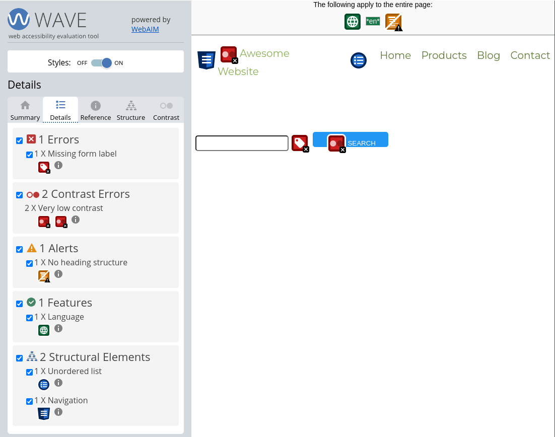
Let’s try it on a small web page containing a navbar and an input missing a label and see what it returns, after installing the extension, we just need to click on the extension icon to use it.

The Summary tab shows 1 error (form element missing a label), 2 contrast errors and 1 alert (missing heading structure), as you can see the result is very clear and detailed. The Details tab will render a list of all the errors, alerts, and features. We can also interact directly on the page by clicking on those red rectangles to check the error description and type.
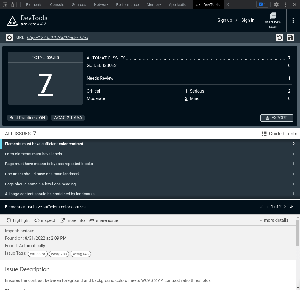
Axe DevTools is a powerful and accurate accessibility toolkit. It is available in both Google Chrome and Firefox. After installing the extension, we will need to open the browser dev tools and go to the axe DevTools tab and click Scan all of my pages.

You can see Axe DevTools has reported the same issues with the WAVE Evaluation Tool which are contrast issues, form element missing a label, and missing heading element, it even gave us some best practices to follow.
An additional way to test for accessibility is to use a screen reader and test your website with it, there are many screen readers available, to name just a few:
We’ve seen in this article some common web accessibility issues, ways to solve them, and some great tools to test for web accessibility. There is still a lot more to cover about accessibility for elements like Dialogs, Accordions, and Carousels but as you’ve seen in this article there is plenty of documentation and tools to help you deal with accessibility.
Some key points to remember:
